Difference between revisions of "Kerr - June 30, 2016"
| Line 3: | Line 3: | ||
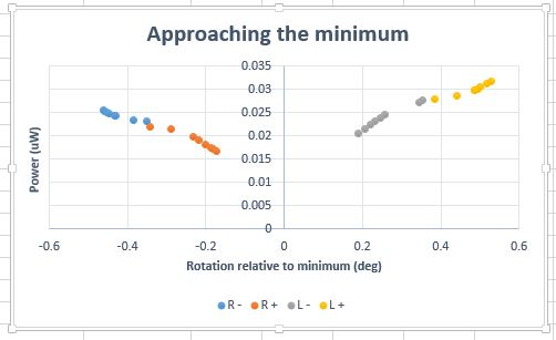
I also graphed a normalized version of minimum approaching data set. However, I am concerned that both of these shapes are not able to fit to our standard Δ p = A*sin<sup>2</sup> θ | I also graphed a normalized version of minimum approaching data set. However, I am concerned that both of these shapes are not able to fit to our standard Δ p = A*sin<sup>2</sup> θ | ||
| − | After a few attempts to fit with excel, I was unsuccessful. I may have to utilize Extrema or Canopy with Python. | + | After a few attempts to fit with excel, I was unsuccessful. I accomplished some fits but I believe they could be better. I may have to utilize Extrema or Canopy with Python. |
Check it out here -->> [[media:LRappminfit.xlsx]] | Check it out here -->> [[media:LRappminfit.xlsx]] | ||
Revision as of 22:08, 30 June 2016
I also graphed a normalized version of minimum approaching data set. However, I am concerned that both of these shapes are not able to fit to our standard Δ p = A*sin2 θ
After a few attempts to fit with excel, I was unsuccessful. I accomplished some fits but I believe they could be better. I may have to utilize Extrema or Canopy with Python.
Check it out here -->> media:LRappminfit.xlsx
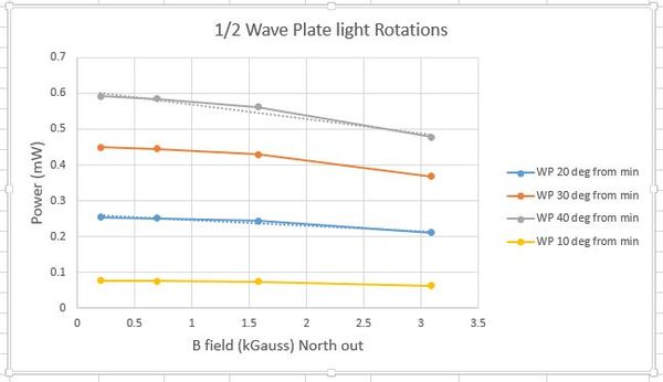
In order to further solidify our Kerr effect claims, Joe came up with an experiment utilizing the half-waveplate. Since we should be dealing with a sin2 graph, we should see different slopes at different starting points of power. I rotated the half-Waveplate (mind you it is twice that reported) 10, 20, 30, and 40 degrees which corresponds to 20, 40, 60, and 80 degrees of rotation on the vertically polarized light.
We do in fact see different slopes for all 4 different starting points.
Check out the work here --> media:multislopeexpgraphs.xlsx


